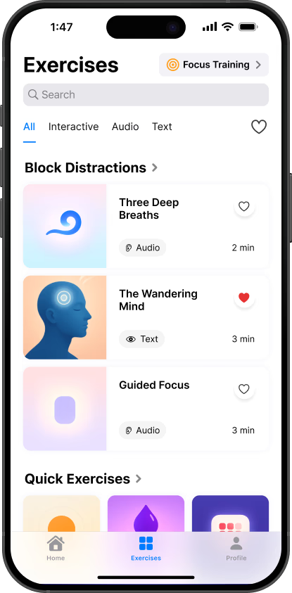
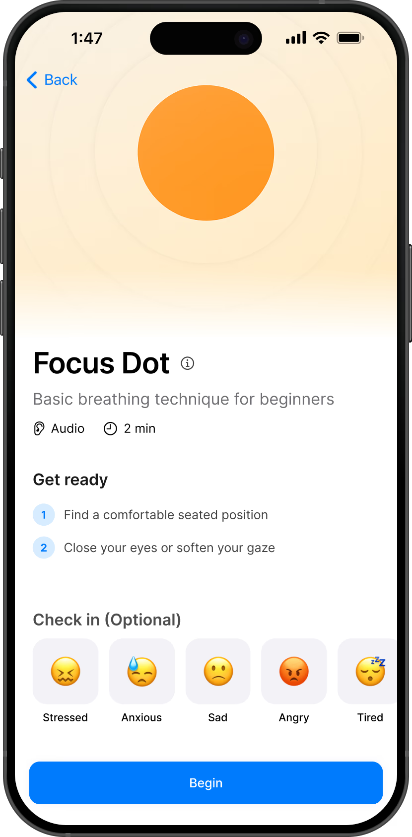
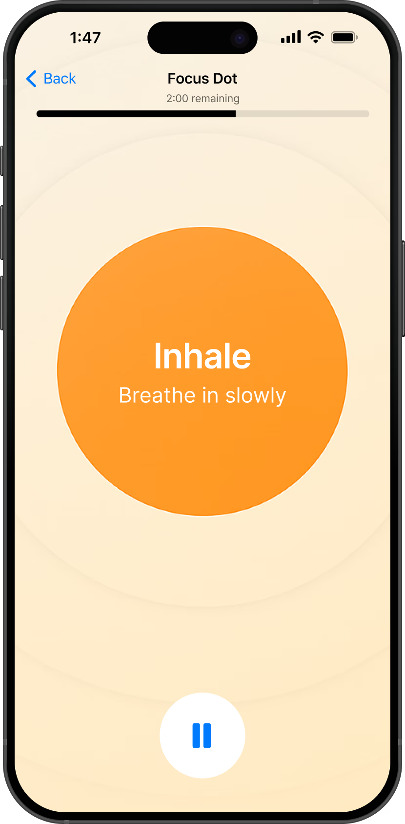
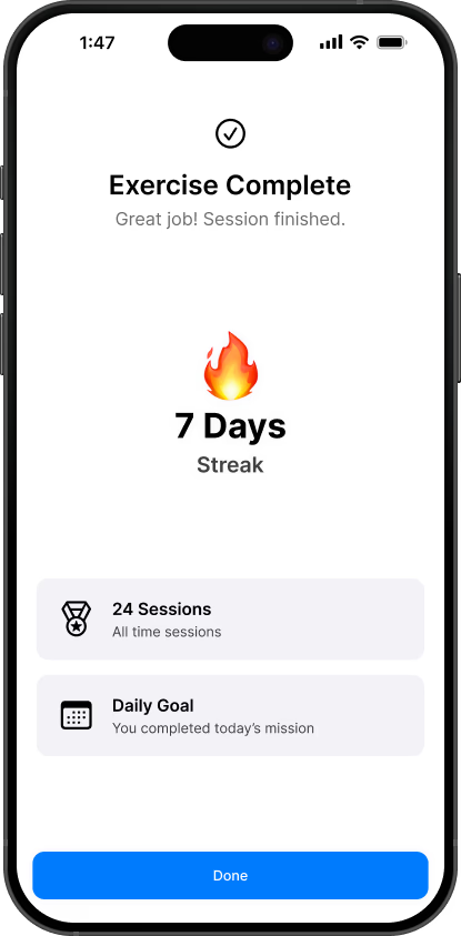
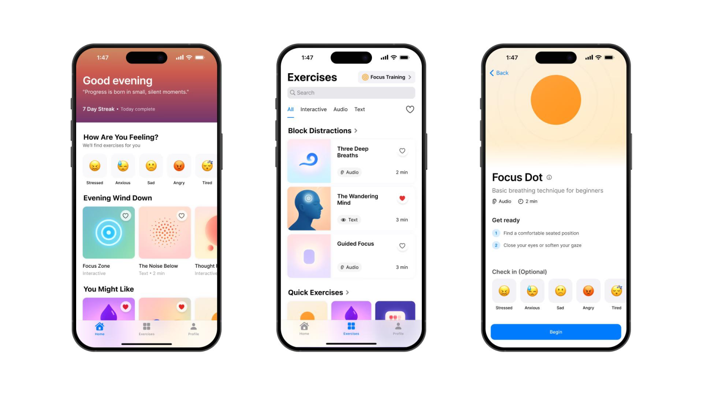
Problem
Great content.
Poor delivery.
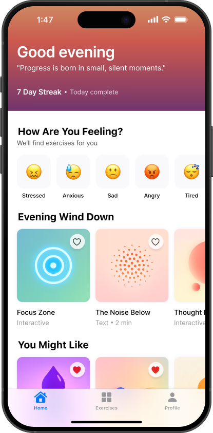
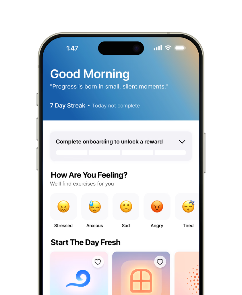
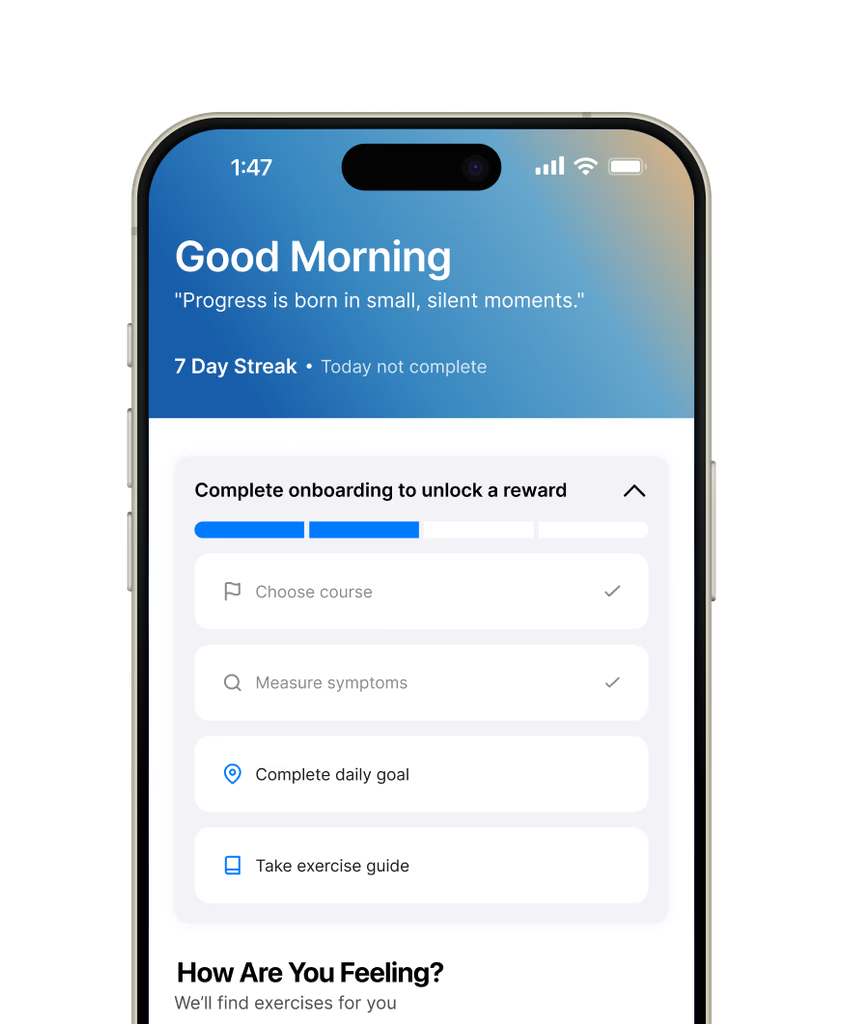
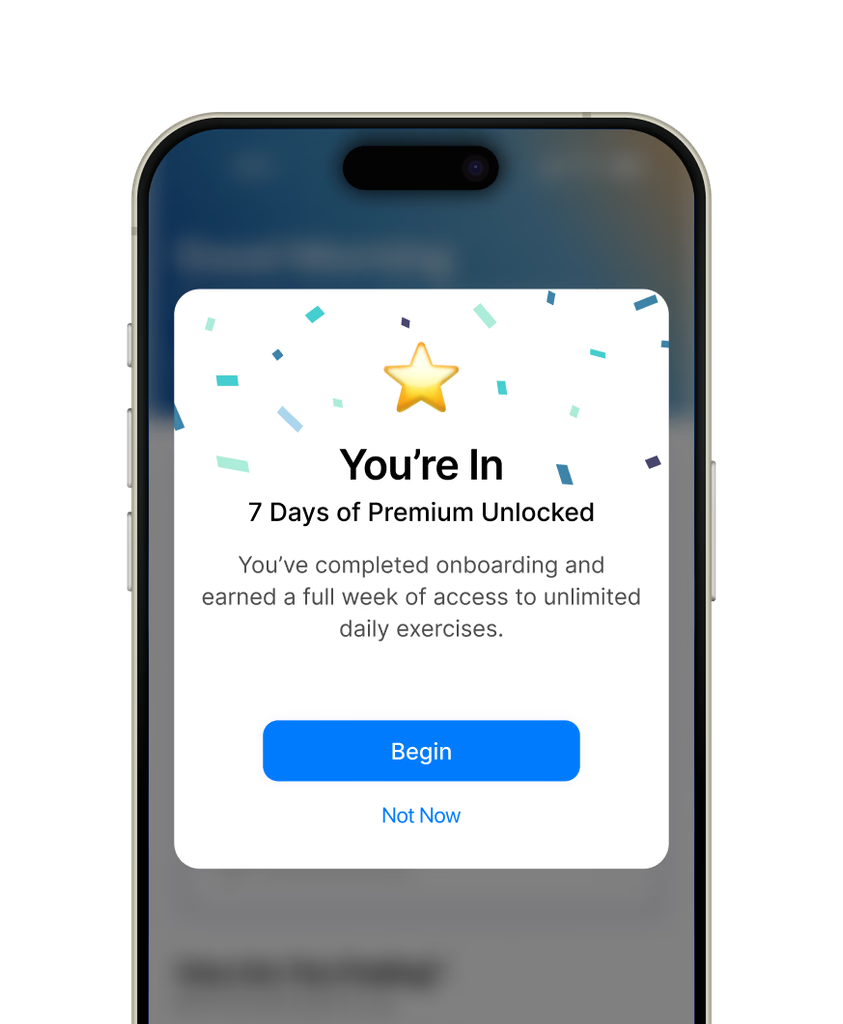
The original Meta Learn had the right ingredients — science-backed exercises, quality programs, genuine expertise in mental fitness. But none of it was reachable. Critical features were buried two or three levels deep. Navigation created dead ends. Progress tracking was invisible. Users dropped off before they ever found what they came for.
The redesign didn't change the content. It changed everything around it.
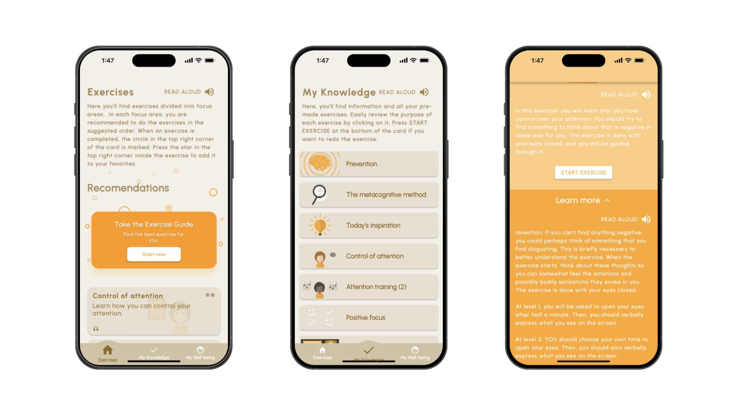
Before
After
Before
After
Before
After